There is a lot to learn through studying art history and images created by others. The practice of making master studies, or master copies, is a time-proven method for learning in art. I personally usually make studies, from photo reference or paintings, when I want to adopt a new stylisation or find inspiration.
A study can be a straightforward copy of the piece of art, or then it can focus on a specific detail or quality of the original. Such aspects could be colour, anatomy, contours, composition or values. The study doesn’t need to be in the same medium as the original – I find it’s a very good exercise to switch materials, and explore how, for example, the atmosphere, or the colour harmony translates from an oil painting into a digital painting.
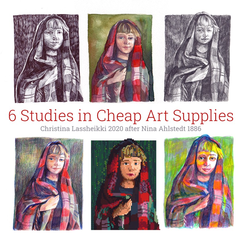
In this post, I created 6 studies; 5 in common office and hobby materials, and one digitally. What follows is what I learnt, and my tips for you:

Original – Nina Ahlstedt: Flicka med storduk (Girl with shawl), 1886
I chose to study Nina Ahlstedt’s (1853 – 1907) painting “Flicka med storduk” from 1886. The piece was probably created at the Önningeby artist colony on the Åland Islands. Ahlstedt was a fennoswedish female painter who worked at the Turku art school, och a personal friend of one of the colony’s founders, Victor Westerholm.
I especially felt drawn to the expression of the portrayed girl. The green-red contrast between the shawl and the background makes it quite an impactful piece as well. Image from Konstnärer i Önningebyn by Kjell Ekström, published by Amos Anderson art museum 2007.
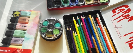
Materials used – Highlighters, cheap watercolours and second hand coloured pencils
Art supplies / materials I used:
- Pencil (2H, HB, 3B)
- Ballpoint pen (black Pentel EnerGel but any is fine)
- Coloured pencils (second hand, Caran d’Ache)
- Highlighters (Stabilo) and a few liners
- Cheap watercolours, watercolour paper, brush
- Paper A5 (Canson Imagine)
- PiskelApp and mouse

Study 1: Pencil
A true classic – the value study in pencil! You can get pretty far in pencil, and if you have an eraser at hand you can even fix mistakes. I worked in 2H, HB and 3B, in that order. I started by lightly sketching the outlines of the subject in 2H, then built values in light layers with a fairly sharpened pencil. I used a lot of pencil sharpener here.
Working with pencil for drawing is a little different than writing. Try to keep a light grip (also prevents cramps in your hands) and use the flat side of the lead for a smooth, larger surface. You can generally build up dark areas without indenting the paper. Don’t press hard on your pencil unless you’re ready to truly commit to the line, and the darker your lead, the harder it is generally to erase.

Study 2: Coloured pencil
For this study I used a set of coloured pencils I usually bring for kids to play with at after school clubs and during babysitting gigs. They aren’t quite the worst quality out there, but Caran D’Ache, a Swiss brand known for quality, and the pigmentation isn’t half bad considering I bought them mainly for the retro tin.
As in the pencil study I started with a light sketch of outlines. Then I started building the colour areas, layer by layer. You probably can’t find a single point in the image where I used only one pencil crayon. Instead the colour is built up little by little. As an extra challenge I did not use black in the drawing, so a more accurate title would be “Study in 17 coloured pencils”. To substitute black I used colour theory; red on green gives a very dark colour, as does blue on brown, or yellow on purple.

Study 3: Cheap Watercolour
A few years ago I got myself a 3 euro watercolour palette at Flying Tiger, with the intent to make a cheap art supply challenge video. Never made it, but these colours have been with me since. They’re actually less terrible than expected in terms of colour palette, however the colours are fairly cloudy and not very pigmented.
I, again, started with lightly outlining the subject, and then worked in layers. Use thin colour – more water than paint – at the start, and more opaque layers later on. Once the colour has dried you can build up the colour depth. I used some colours straight from the palette but for others used a porcelain plate for mixing.
Personally I find that which paper and brushes you use has a far bigger impact on the result than the paints. Good quality paper, with sizing, essentially allows you to eg. erase the paint with a natural sponge or clean brush, while a paper not intended for watercolour or mixed media will absorb either everything, or not enough, wrinkling the paper. A good brush keeps its point, which means one good, larger brush will be better for details than multiple bad quality ones. The paper I used was Lanford 50/50 cotton blend, and a Black Ruby synthetic brush. But, I have used cheaper materials with good results as well, like Montmartre-brand brushes or Canson Imagine paper.

Study 4: Ballpoint Pen
Black ballpoint pen is quite a fun, if permanent, medium for a value study. I recommend starting with something erasable if you’re feeling anxious, but there is something freeing about working in a permanent pen. The one I used was a little unpredictable, so you might spot some unexpected spots on the nose, for example. It’s part of its charm, I guess.

Study 5: Highlighters and Liners
Once you’re at it it can be fun to test something slightly crazy – like using highlighters as your medium for such “serious” work. I worked similarly as to watercolour; layer by layer. It turned out these markers layer poorly, so to add depth – and contrast – I turned to liners.
Study 6: Pixel Art
For my final study I worked in pixel art, using PiskelApp. PiskelApp is a free, browser-based free tool that is extremely handy and easy to learn. I’ll be adding my getting-started with PiskelApp tutorial PDF here soon, but until then, test PiskelApp here: https://www.piskelapp.com/
In summary:
Not only is making studies very teachable, but it’s also a lot of fun. If you decide to create some of your own, experiment, test something new and study the piece you’ve chosen in-depth. If you find it hard to get the proportions right, an old trick is to turn the picture upside-down for sketching.
I had so much fun with these, and I’m especially happy with my coloured pencil study, but the pixel art one also exceeded my expectations.
Tag me @classheikki in your creations, and use the hashtag #6StudiesChallenge if you want, if you share them on Instagram or Twitter! Here’s a grid for you to use if you want:

Take care and stay creative!
– Chride ❤

