
The year is 2016, and for the first time I’m not working on a massive project as October rolls around – so I decide to try that cool challenge that has been going around my social medias – Inktober! 31 days of ink illustrations around different themes. October 2016 I’m not yet on instagram, so I decide to post my results on facebook and tumblr.
So, late September 2016 I gather my bookbinding supplies, and followed Sea Lemon’s youtube tutorial on how to make a coptic stitch bound sketchbook. I used Canson Imagine paper and some old backings from sketch blocks (and washi tape to add a stripe of lilac-backed stars, just so it doesn’t look too ruggedly stylish):

The month starts. As you can see on that photo above, I made a little vinjette as an opening, to get used to my tools.

I was planning on really using the month to get better at inking. I end up getting the whole list of prompts done, make a little timelapse video, and learn a bunch about different ways to use my tools; how to combine watercolor and fluid ink (watercolor first); and which ones of my brushpens I actually enjoy using (tip: not the Sakura ones).
All in all I have a great time; great enough that I do inktober twice more for 2017 and 2018 (I end up skipping 2019 because of burnout). 2020 rolls around and this year I technically have time. But I’m choosing not to do inktober. Why?
1. The case of alleged plagiarism
The founder of the #inktober hashtag is Jake Parker, a comics artist who also runs the Society of Visual Storytelling online school, and hosts the podcast Three Point Perspective. Parker also makes educational youtube videos, and I genuinely find both his work – from the comics of his I’ve read in high school in my friend Santtu’s copies of the “Flight” comics antologies – to the short and informative videos on topics like finding motivation as an artist, really great. I subscribe to his philosophy of you need a product, not a project (within limits) and the podcast has taught me a lot of useful skills to apply to my own visual storytelling. Granted, I’ve heard some call his no-bullshit-approach to sticking with your projects ableist (and I somewhat agree).
But this is not the reason the online art and illustration community has been boycotting the Inktober project this year, and why for example DeviantArt cancelled it’s inktober awards.
The first reason is this video, which I recommend you watch, and form an informed opinion:
In Finland we have very strong libel laws, and because of that, I won’t claim one thing or another. As an art teacher, I have a lot of sympathy and find the whole thing quite sad, for both Parker and Dunn.
But, inktober isn’t Jake Parker’s thing anymore, is it? It doesn’t directly support him to use it, right? Well, no, but:
2. The inktober trademark
The second reason, however, is that “inktober” as a term has been trademarked by Parker. And that makes it hard to use as an independent artist. The rules for usage of the “inktober” term are fairly lax, but still there. For example, if I hosted a workshop on inking techniques and wanted to advertise it with the word inktober, I would technically need to clear this use of the trademark with the trademark holder.
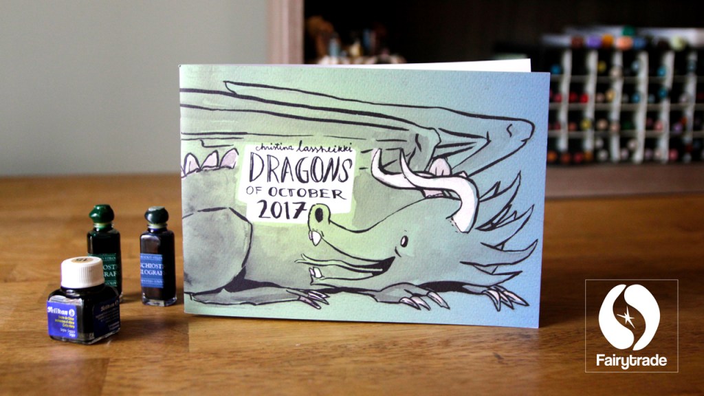
Ironically, as I subscribe to the I need a product, not a project philosophy of Parker, the trademark makes it trickier for me to do just that; create a product out of my inktober project, since there are rules of how inktober can or can’t be in the product name. Funny enough, my 2017 inktober zine does abide by the rules by sheer dumb luck alone.
3. The saturated hashtag
I also have a third reason, which is that I believe, on a personal level, that the kind of gain you get from taking on an art challenge should align with your current goals as an artist. So, if you’re alright with the alleged plagiarism, and with the trademark, then you still need to ask yourself; what do you expect to gain out of creating 31 ink drawings around themes someone else picked out for you?
You won’t get much visibility and recognition by default. It’s amazing to see how many pick up the nib pen as October rolls around, but for the past two-three years the trend has been really saturated, to the point where participating in Inktober no longer gives you higher discoverability on social media. Heck, some youtubers will create a video about every single day of their inktober journey.
As an art educator, I’m thrilled to see former students early in their careers or studies, and I can only aspire to have an ounce of their enthusiasm; as well as seasoned industry professionals, who I can only aspire to have an ounce of their skills; but that makes it very hard to stand out as a young professional whose beginner charm has run out, but still has an online following in the hundreds, not thousands.
So the lesson is this; you aren’t owed anything. The call to the inktober challenge is heeded by the masses, and your herculean effort will not give you glory. You need to set yourself a goal in the work, or just in having fun with challenging yourself, not the recognition it might give you.
I’m still doing a 31 day challenge this October, what are the 5 tips?
Alright! Don’t get me wrong, I applaud you. Let’s look at my five tips to you:
1. Figure out an overarching theme
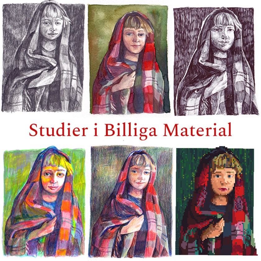
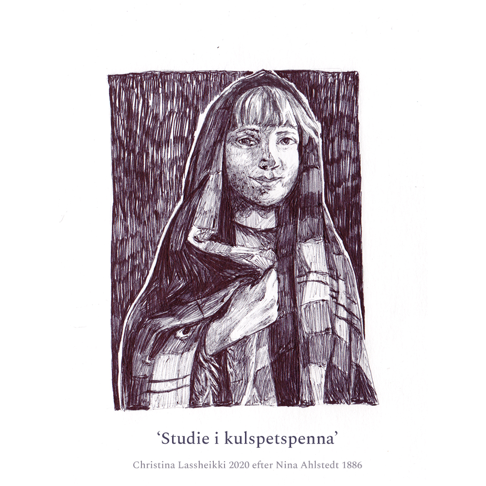
2016 I followed the official prompt list and let my imagination run completely wild.
That is how I ended up with images like this:
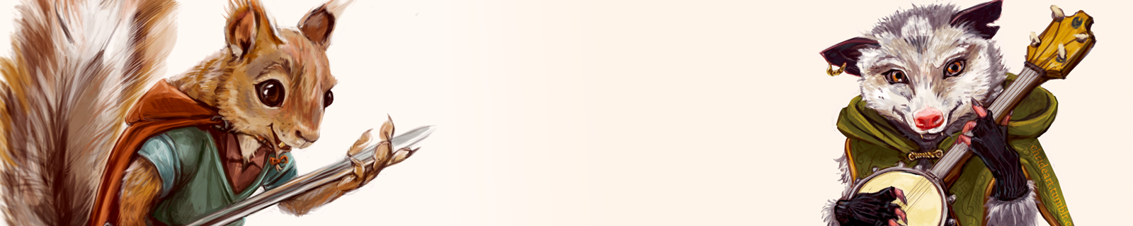
But also these:

It’s good to mix it up a little, but some consistency makes it easier to see the pieces as parts of a whole, and to see your own progress through the month.
Of course, if your goal is to mainly explore new possible mediums, then do that!
But, I felt, flipping through that 2016 sketchbook, that it would be better to have a consistent thread running through the whole thing. These days there are a bunch of alternative hashtags, and alternative promptlists you can go with, but I did something a little different:
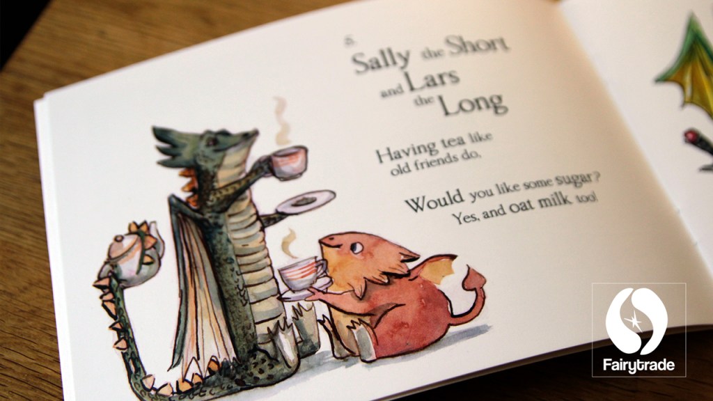
- 2017: #Dragontober. Every prompt interpreted as a dragon. I also named each dragon and wrote a little description. I can’t say for sure that I was the first, but during 2017, someone else joined me in the hashtag – and now there are a bunch of #dragontober projects out in the world.
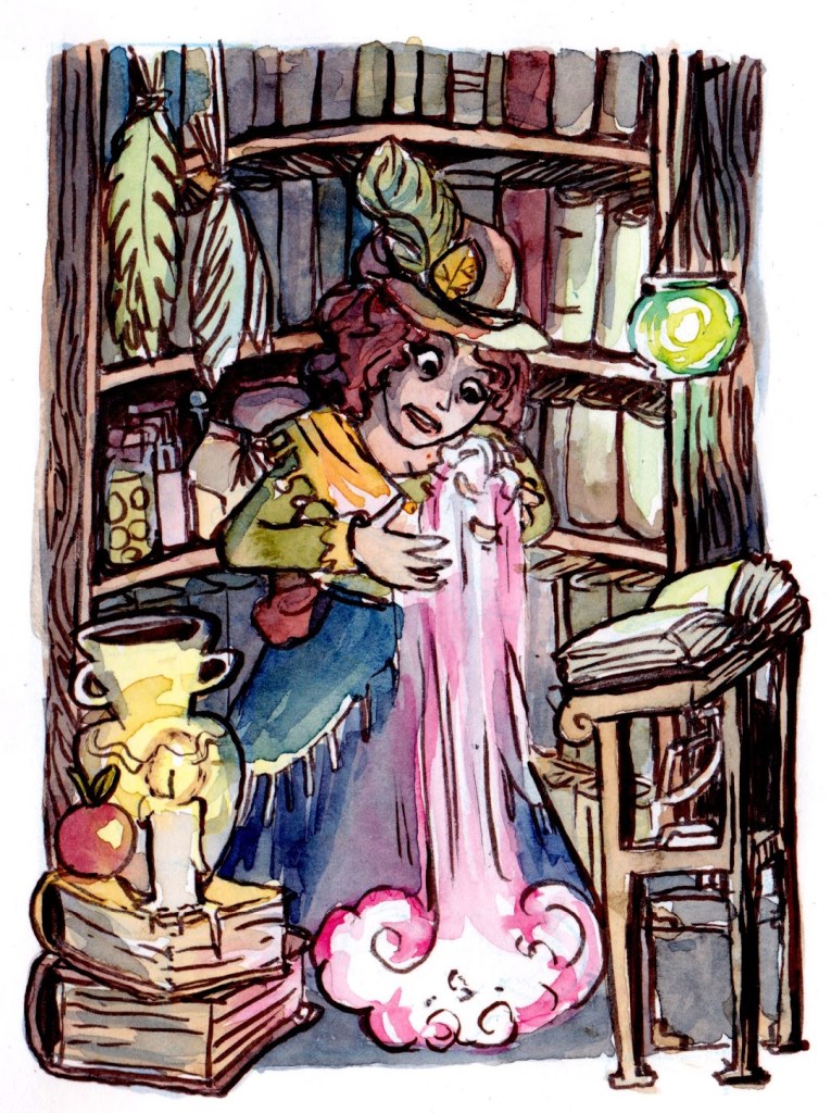
- 2018: The House of Magic. Every prompt interpreted as a room of a magic house, each leading into the next one. Alliterated alcoves and star sculleries; almost all of them with a tenant or visitor as well.
For me personally, the added challenge of the content of the illustration was exactly what I needed to make it suitably specific. Long on its own is alright, but a long dragon? Clearer.
You can probably come up with a bunch of other ideas! May has the project MerMay for mermaids and merfolk, and September Swordtember. Some do #WitchTober which I would’ve done had I done Inktober this year.
2. Plan a product
Imagine holding a 32-page zine with your art, and a few words about your process. The creamy, textured paper of the cover. Your name and the year on the back. Flipping through those pages – nice, right?
The National Novel Writing Month used to have a winner’s perk that was one paperback proof copy of your novel from a self-publishing house. There was some paperwork included, and I was accidentally sent a copy of someone else’s family memoir as well – but that was such a motivator for teenage Chride to write 50k words in one month.
These days it’s actually fairly cheap and quick to make a limited run zine. I’ve sold my 2017 Dragontober zine at Christmas markets, comics festivals and online – and it makes for a pretty neat gift for friends and family as well, to hand over your own art work in print.
Let me know if you want a tutorial on how to prepare a zine for print as PDF, or you can always contact me if you’re looking for graphic design work.
If you don’t like the idea of a zine, perhaps you want to gift yourself your best illustration as framed? Or make a Holiday card out of it?
3. Get it done, but cut yourself some slack
Finished, not perfect is another of Parker’s sayings that I aspire to abide by. You don’t have to post every day, but try to finish the images. Schedule in your hours when you can work on your project.
If you fall behind, be ready to lower your standards in favour of keeping up with the project. I was able to catch up mainly during weekends, but only 1 or 2 days.
Didn’t finish after all? Don’t feel embarrassed – I still need to finish the 2018 project (one day…).
4. Thumbnail, then sketch, then ink
The practice of thumbnailing is the perhaps most important practice I’ve found that A) wasn’t taught to me at school B) saves time and C) improves your final work. For a quick illustration, I try to get 2-3 thumbnails done – then choose my favourite (or client’s favourite) to refine.
Basically, it’s a quick, miniature sketch. Think of it as the matchbox-sized version of your A4 or A5 piece. Use it to figure out composition, perspective, relations and basic character design.
Alphonso Dunn explains it better:
Once you have your thumbnail, sketch your illustration out in your real size, and only then ink it. If you’re working digitally, you can scale up the thumbnail to use as a guide, even.
5. Erasable colored pencils and kneadable erasers
My fifth and final tip is a tool I found made sketching a lot nicer. It’s a little tricky perhaps to find, but, if you come across these in your local art store, I definitely recommend picking them up.
Erasable colored pencils.
Why? Well, this is a question of preference. Most graphite lead – found in your typical mechanical or regular pencil – smudges, and especially when working on porous or textured surfaces you may end up with hard-to-erase lines that. And, depending on your inking tool of choice, using an eraser after inking can lead to faded ink lines or the ink smudging.
Graphite lead is also typically a blackish shade of grey, which means the contrast to your ink line might not be that great if you decide not to erase it; and to top it off, the graphite forms a smooth metallic surface that ink doesn’t necessarily penetrate.
But if you work in colored pencil instead, you get to choose what color the lines are – and you might not even want to erase them (look to artists like Loish). A non-photo blue pencil used to be my go-to, since it was easy to edit out in post, but I found I like working in purple, red and green as well. The pencil blends in with watercolor better, and gives an extra hint of a hue to the black-and-white pieces.
Then, a kneadable eraser, or artist’s putty eraser – allows for precision in erasing. It also doesn’t harm your paper as much as a hard eraser, I’ve found, and acts as an excellent stress toy.
Go forth, make good art!
I want to leave you with Neil Gaiman’s words: Make good art.
No, not perfect. No, not good to me. Good art – to you. Make it your own.
Thank you for reading this far. Let me know if you want me to write on another topic as well!
Cheers, Chride
Disclaimer: This is a work of critique and education. I am claiming fair use of the term “inktober” within this blog post. Please contact classheikki [@] gmail.com if you are the trademark holder for the term “inktober” and feel this is not a fair use case.